Mistake #1 Brand Colours
What does your logo and colour scheme say about you and your brand? How about the font you are using? How long has it been since you updated your logo?
Yes, it’s crazy I know – but you may be losing business simply because of what your branding says about your business!
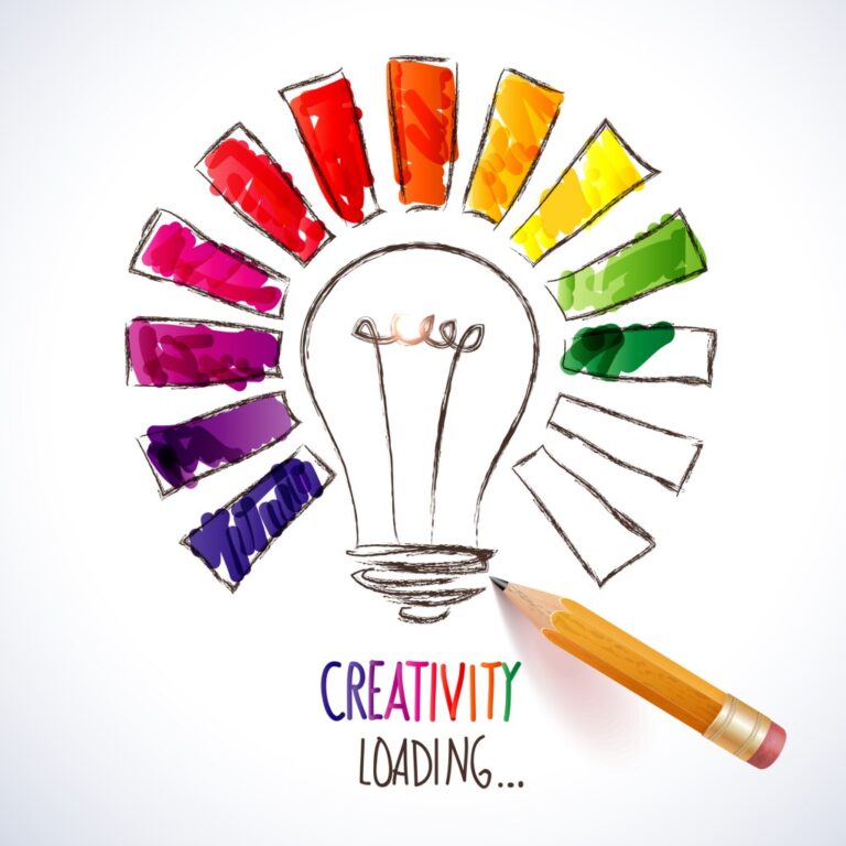
In this mini-series we will look at branding mistakes you may be making and how to fix them.
First, lets look at the psychology of colour, and then we’ll dive into how to evaluate your brand colour.

What colors mean for branding
Virtual Print, a leading online printing service in NZ, recently reminded us that colours have a big impact on the decisions people make.
They emphasise that it is important to finalise colour combinations that will be repeated throughout your entire range of marketing communications. Product Labels need to illustrate exactly what the product is about and evoke emotions with the consumer. This will always differ depending on what product you are offering. Labels are often more important than billboards, so it is just as important to choose colours that are unique and effective with your labels.
- Colors can influence up to 90% of a person’s first impression.
- Colors are perceived differently by men and women based on their gender and culture.
- 35 percent of women and 57 percent of men prefer the colour blue.
- 85 percent of buyers’ purchase decisions are influenced by colour.
- Colors improve brand recognition by 80%.
- People’s behaviour, mood, and stress levels are all influenced by colour.
- When it comes to shopping, 93% of people are solely concerned with the looks of a product.
They go on to say that colors have a significant impact on purchasing behavior because of their impact on how a brand is represented; colour determines how shoppers perceive the business’s “personality.”
Virtual print suggest that you first need to understand your audience and what appeals to them. There are some obvious segmentations that you can make including country, age, and behavior.
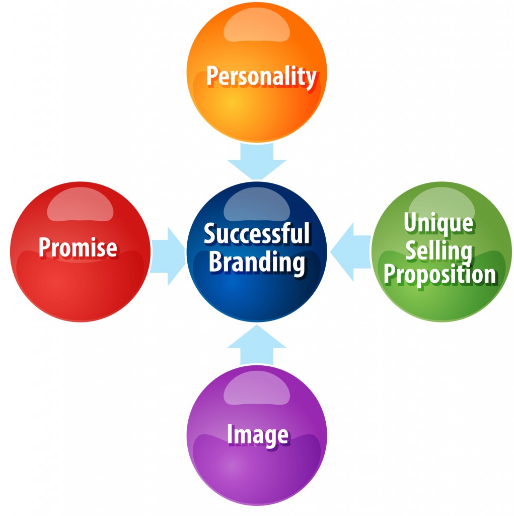
What do your branding colours say about the personality of your business?
According to Matt Solar, VP of Marketing at nDash.co, the psychology of color can help your business establish trust and familiarity by eliciting the right emotions. Matt quotes studies that have found that a product’s color influences 60 to 80% of a customer’s purchasing decision. This means that the right choice of color does not only strengthen the brand association, but it can also affect your total sales.
What colors are best for branding?
Solar says, blue seems to be the winning color, as it shows up in 33% of the top 100 brands. Red comes second by showing up in 29% of the brands, and black or greyscale make the third most popular choice with 28%. Finally, 13% use yellow or gold. What’s interesting is that 95% of the top 100 brands only use one or two colors.
According to Virtual Print:
Blue: Stability, harmony, unity, trust, truth, confidence, conservatism, security, cleanliness, order, loyalty, sky, water, technology, depression, and appetite suppressant
Red: Speed, strength, power, heat, aggression, danger, fire, passionate, sincerity, happiness
Yellow: Joy, happiness, betrayal, optimism, idealism, imagination, hope, sunshine, summer, gold, philosophy, dishonesty, cowardice, jealousy, covetousness, and deception
Green: Nature, good luck, rejuvenation, youth, spring, generosity, fertility, jealousy, service, inexperience, envy, misfortune, and vigour
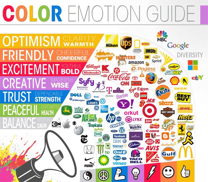
Canva tell the story of Google, who chose red, blue, and yellow because they are the primary colors. They are also the most used colours as seen above.
However, they added green to show they don’t always follow the rules. This childlike palette makes technology seem less intimidating—appropriate for a company that prides itself on making things really easy to use.
How to Choose your Brand Colour
Canva suggest the following steps to choose your branding colours:
- Embrace color theory to understand what colors mean.
- Identify what your brand is about so you can align with relevant colors.
- Consider your competitors so you don’t look the same.
- Create and test a color palette across all brand touchpoints.
- Create brand guidelines so your brand always looks the same.
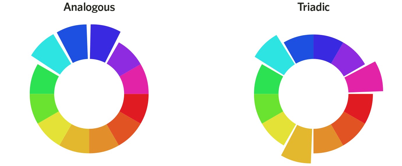
Writer and marketing strategist, Gregory Ciotti quotes two studies on color combinations, one measuring aesthetic response and the other looking at consumer preferences, found that while a large majority of consumers prefer color patterns with similar hues, they also favor palettes with a highly contrasting accent color.
In terms of color coordination, this means creating a visual structure consisting of base analogous colors and contrasting them with accent complementary (or tertiary) colors:
Evaluating your brand colour scheme
What does your colour scheme say about your business?
Is it dated?
What working in the 70’s may not be working for you now
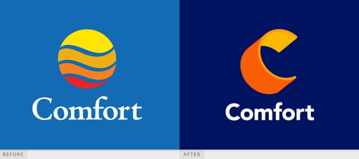
Superside illustrate this with Comfort Inn. The blue they used was starting to look old fashioned. The update is much better.
Is it sending the wrong message?
Kathmandu recently changed their colour scheme to reflect that they are about joy, rather than conquering mountains.
Kathmandu chief executive Reuben Casey said the new messaging was focused on enjoying and preserving the natural world.
“This is a reset moment for us, to be a lot more playful and fun and carefree,” Casey said.
“We don’t want to be too serious, the kind of climbing the mountain, battling the elements brand. Outdoor companies around the world are generally about snow, mountains, suffering and achievement. That’s not us.”
Does it create the right impression?
A fun color may not send the right message for a security firm.
You will notice that Chubb Security use blue as their brand colour as it suggest security, trust, dependability.

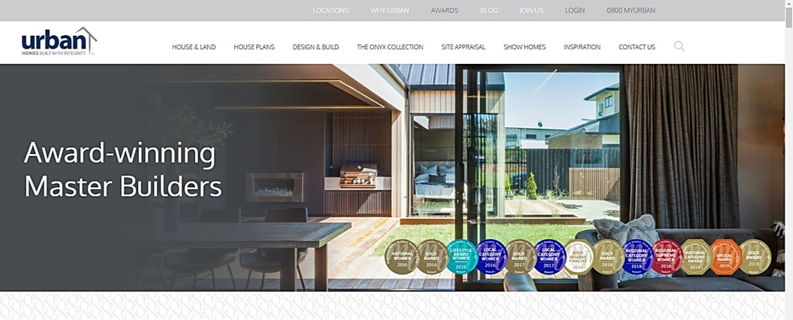
Likewise, Coromandel Builders in Whangamata and Whitianga, Urban Homes, use navy and gray to create a similar impression. Navy represents integrity and expertise, while Gray indicates security and intelligence.
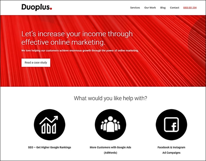
Online marketing and Google Ads agency, Duoplus, use red to suggest passion and results.
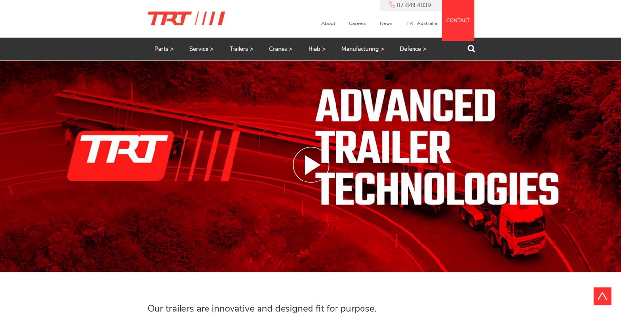
Truck and Trailer company, TRT, also use the colour red, as it signifies a pioneering spirit and leadership qualities, promoting ambition and determination – things TRT are famous for in their industry.
Does it match your target audience?
Virtual Print also emphasise the need to research your target audience. The believe that a key marketing principle is to know who your target market is and what is going to attract them. So, finding out what your consumers want to buy is just as essential. By segmenting your target market into demographics (employment, education, income, marriage rates, age, etc), and geographics, you can get one step ahead of appealing to the people who are most likely to purchase your product.
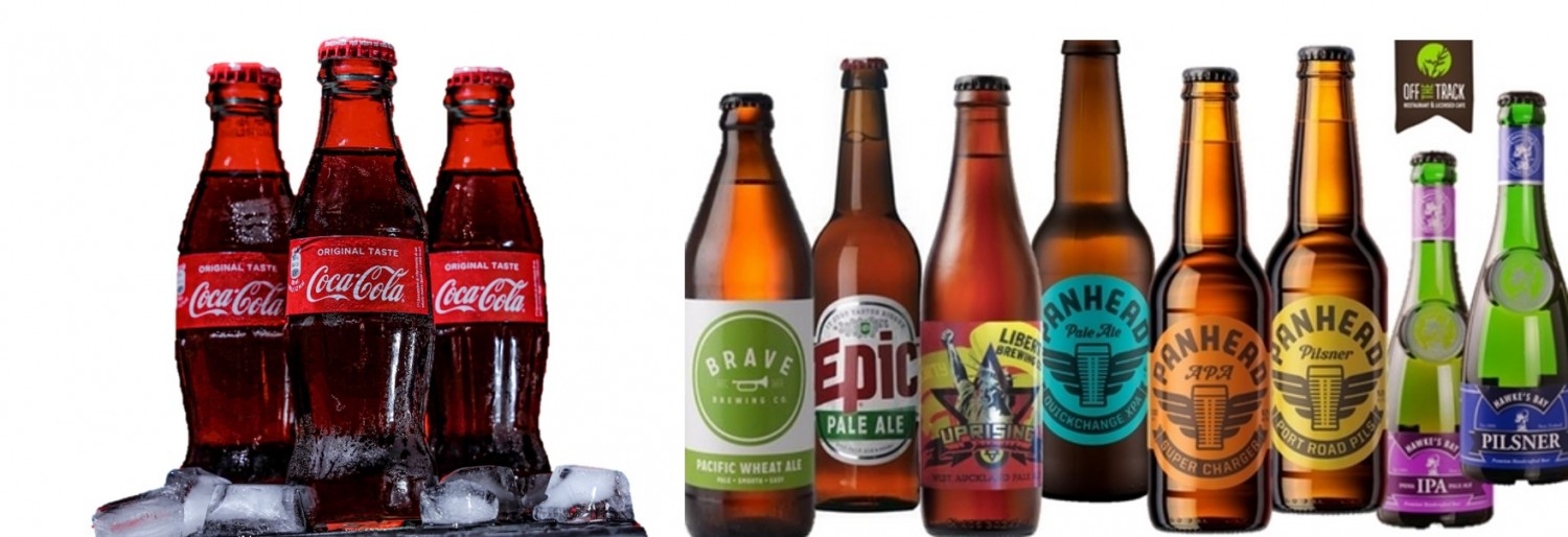
Just pick age for example. Does your brand colour reflect the age you are appealing to?
Take a look at the following beverages. Which colour schemes would appeal to a younger audience? Which is aimed at adults?
How does it compare to your competitors?
In The 22 Immutable Laws Of Branding, Al Ries and Jack Trout state that there is “powerful logic for selecting a color that is the opposite of your major competitors. When you ignore this law of color, you do so at your own risk.”
Be the opposite. Kodak is yellow, so Fuji is green.
Or in New Zealand’s case:
Goldstar Heat Pumps, the top-selling Fujitsu heat pump provider in New Zealand, are a rare company Zealand using yellow as their brand colour.

This colour sets them apart from all of their competitors. Using yellow also suggests warmth and optimism.
It is original and memorable?
Finally, does it stand out? Will people remember it long after they’ve seen it?
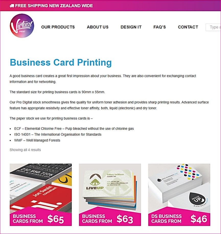
Virtual Print certainly stand out with their brand colours of pink and purple. They recommend that your design should look new, memorable, and original. Speaking about label printing they note that a label that’s eye-catching and uses good lettering is nothing unless it is something that people have never seen before. This is especially true if you are looking to enter a market rather than maintain a reputation in one.
So there you have it.
What does your logo and colour scheme say about you and your brand?
What do you want it to say?
How long has it been since you updated your logo or colour scheme?
Next week I’ll look at typology – fonts! Stay tuned.